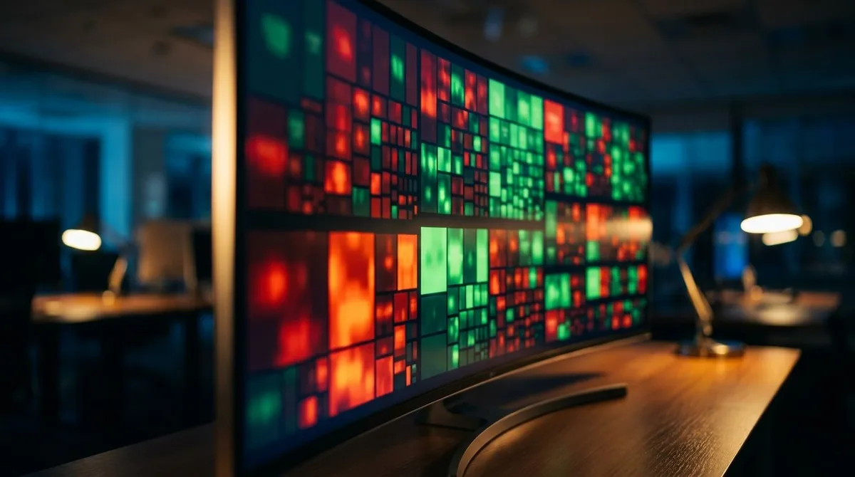
You open your brokerage account and see a wall of red and green numbers flashing on the screen. Trying to understand the overall market trend by looking at individual stock tickers is like trying to understand a forest by staring at a single tree. A stock market heatmap by sector is a visual tool that groups stocks into their respective industries and uses color coding to show performance at a glance.
We're going to walk you through exactly how to read these maps to spot market trends instantly. Our team relies on these visual scanners every single morning to find the strongest stocks in the strongest industries. By the end of this guide, you'll know how to set up your own daily scanning routine using free platforms. You'll also learn how to avoid the common traps that catch new traders off guard.
What Is a Sector Heatmap?
Bottom Line: A stock market heatmap by sector compresses the noise of thousands of individual tickers into a single, color-coded view of where money is moving across the economy. The real edge comes from pairing that visual scan with a disciplined routine: confirm setups with technicals, check volume, and size positions according to a fixed percentage of your account. The heatmap tells you where to look. Everything after that is risk management.
A sector heatmap is a visual representation of stock market data that groups individual companies into their broader industry categories. It uses color intensity to display price performance and block size to represent market capitalization. This allows traders to instantly see which areas of the economy are leading or lagging.
We teach our members to think of a stock heatmap by sector as a weather radar for the financial markets. Instead of showing rain or snow, it shows buying and selling pressure. Bright green indicates strong positive performance, while dark red shows heavy selling.
Key Concept: Heatmap color coding follows a simple scale. A stock up 3% or more appears bright green. A stock up only 0.5% looks pale green or almost black. Minor losses show up as pale red, while severe drops of 3% or more glow bright red.
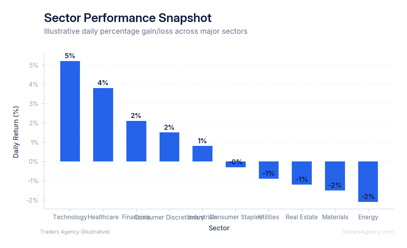
This visual shorthand saves you hours of research. Instead of reading through hundreds of earnings reports, you can glance at the screen and immediately know that the Healthcare sector is experiencing heavy buying volume.
How Does Market-Cap Weighting Affect the Heatmap View?
Market-cap weighting means that larger companies take up more physical space on the heatmap. A trillion-dollar company will appear as a massive block, while a billion-dollar company will look like a tiny square. This accurately reflects their proportional impact on major indexes like the S&P 500.
When you look at a standard heat map market display, you'll immediately notice that the Technology sector takes up a massive portion of the screen. Companies like Apple (AAPL) and Microsoft (MSFT) dominate the visual space. Their blocks are huge because their market capitalizations are enormous.
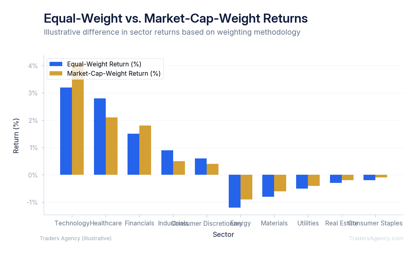
This weighting is highly practical for traders. If a massive block like AAPL is down 3%, it drags the entire market down with it. The heatmap visually explains why the broader market index might be falling even if hundreds of smaller stocks are actually green for the day.
However, this sizing dynamic can also hide strength in smaller stocks. We always advise our students to look closely at the smaller blocks to find emerging trends. A tiny square glowing bright green might represent a mid-cap company breaking out to new highs.
What Free Tools Can You Use for a Stock Market Heatmap by Sector?
You don't need expensive software to get started. Many traders use a stock market heat map free of charge through popular web platforms. You can also use heatmaps that brokerages like Fidelity offer directly in their active trader software.
We prefer to use Finviz and TradingView for our daily scans. Here's how we teach our members to set up their screens.
1. Setting Up Finviz
- Go to the Finviz homepage and click the "Maps" tab at the top of the screen. You'll immediately see the S&P 500 grouped by sector.
- Change the performance filter from "1 Day" to "1 Week" to see broader trends. This filters out daily market noise and shows you the true underlying momentum.
2. Configuring TradingView
- Open TradingView and select the "Stock Heatmap" tool from the main products menu. This provides a highly customizable stock market heat map app for both desktop and mobile devices.
- Filter by the Russell 2000 index if you want to find small-cap opportunities. You can also adjust the color theme if you are colorblind or prefer a different visual contrast.
3. Customizing Your View
Always adjust the data source to match your trading style:
| Trading Style | Recommended Timeframe | Best Use Case |
|---|---|---|
| Day Trading | Intraday | Spot quick momentum shifts during the session |
| Swing Trading | 1 Week to 1 Month | Find longer-lasting sector trends |
| Position Trading | 1 Month to 3 Months | Identify major sector rotation themes |
Our team usually sets the view to show the S&P 500 on a one-month timeframe when we're planning our swing trades for the upcoming weeks.
Want expert trading insights delivered daily?
Join thousands of traders who rely on Traders Agency for market analysis and trade ideas.
Join Traders AgencyHow Do You Use Heatmaps to Identify Sector Rotation?
Sector rotation happens when institutional investors move their money from one industry to another. A stock market heatmap by sector makes this institutional footprint highly visible. You can literally watch the money flow across your screen.
For example, you might notice the Technology sector turning pale red while the Energy sector turns bright green. This visual shift tells you that money is flowing out of growth stocks and into commodity-based stocks.
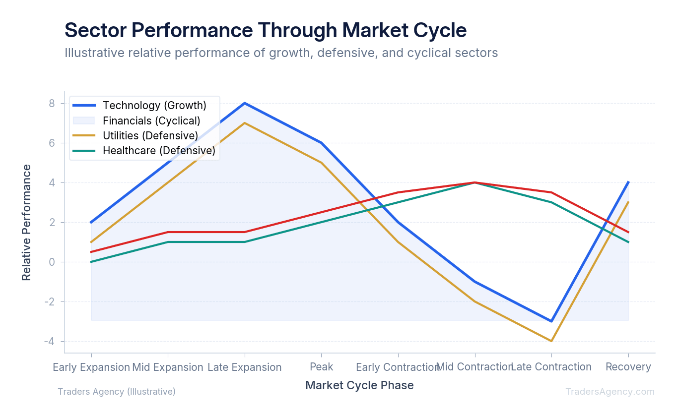
We look for specific patterns to confirm these shifts. If the Financial sector, represented by ETFs like XLF, is leading the market higher, it often signals confidence in the broader economy. Banks usually perform well when interest rates are favorable and lending is strong.
Different sectors tend to perform better during different economic phases, a concept covered in the SEC's guide to savings and investing. Heatmaps let you track these phases in real time. If you see defensive sectors like Utilities and Consumer Staples glowing green while everything else is red, the market is likely preparing for an economic slowdown.
Key Concept: When defensive sectors (Utilities, Consumer Staples, Healthcare) lead the heatmap while cyclical sectors (Technology, Consumer Discretionary) lag, it's a classic signal that institutional money is rotating into a risk-off posture. Watch for this pattern to develop over two to three consecutive weeks before treating it as a confirmed trend.
How Do You Build a Daily Pre-Market Heatmap Routine?
Professional traders don't just stare at charts randomly. They follow a strict, repeatable routine. Using a stock market heat map live during the pre-market session gives you a massive advantage before the opening bell even rings.
Here is the exact step-by-step routine our team recommends for daily preparation:
- Check the overnight action. Open your heatmap 30 minutes before the market opens. Look for sectors that are gapping up or down significantly based on overnight futures trading.
- Identify the news driver. If the Healthcare sector is bright green, check the financial news feed. You're looking for a major regulatory announcement or a massive earnings beat from a company like Johnson & Johnson (JNJ).
- Pick your targets. Select two or three specific stocks within the strongest sector to focus on for your daily watch list. Do not try to trade the entire sector at once.
- Monitor the open. Watch how the colors shift during the first 15 minutes of regular trading. This is where the real momentum reveals itself.
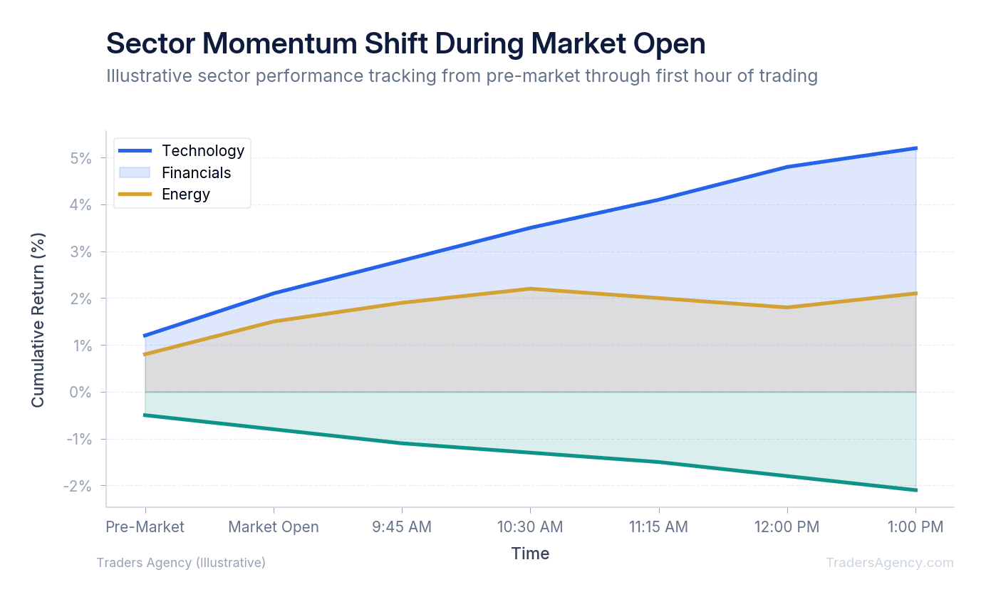
By tracking the momentum shift from pre-market to the open, you can avoid buying into a false gap up. If a sector opens bright green but immediately starts fading to black and then red, you know the early buyers are trapped. We use this exact sequence to plan our morning trades.
When Should You Not Use a Heatmap?
You should never use a heatmap as a standalone buy or sell signal. Heatmaps show past and current performance, but they do not provide technical entry points or fundamental valuation metrics. They are excellent scanning tools, but they cannot replace proper chart analysis and risk management.
Watch Out: One of the biggest mistakes beginners make is blindly buying the brightest green square on the screen. By the time a stock is up 10% and glowing neon green, the optimal entry point has usually passed. You're buying at the top of the move, right when early buyers are getting ready to take their profits.
We teach our members to use the heatmap to find the right neighborhood, then use technical analysis to pick the exact house. Once you identify a strong sector, you must still open a standard candlestick chart. You need to look for proper support levels, moving averages, and clear breakout patterns before risking your capital.
Always verify the trading volume before taking a trade based on heatmap colors. A stock might show a bright green 5% gain, but if it only traded 1,000 shares, that price movement is completely unreliable. Low float stocks can easily fake out a heatmap scanner.
Risk management remains your absolute top priority. Even if an entire sector looks incredibly bullish on the heatmap, you must still use strict stop losses and control your position sizing. We rarely allocate more than 5% of our total account capital to a single trade. If you have a $10,000 account, your maximum position size on any single idea should be $500, regardless of how good the heatmap looks.
| Account Size | Max Single Position (5%) | Example Sector |
|---|---|---|
| $5,000 | $250 | Technology breakout play |
| $10,000 | $500 | Healthcare earnings momentum |
| $25,000 | $1,250 | Energy sector rotation swing |
| $50,000 | $2,500 | Financial sector trend follow |
Risk Warning: Heatmaps are scanning tools, not trading signals. Always confirm setups with technical analysis, verify volume, and apply strict position sizing rules before entering any trade. No single visual tool can replace a complete risk management plan.
Want expert trading insights delivered daily?
Join thousands of traders who rely on Traders Agency for market analysis and trade ideas.
Join Traders AgencyKey Takeaways
- A stock market heatmap by sector uses block size to represent market capitalization and color intensity to show price performance, letting you assess the entire market in seconds instead of scanning individual tickers.
- Color coding follows a direct scale: bright green signals strong positive performance while dark red indicates heavy selling pressure, functioning like a weather radar for buying and selling activity.
- Heatmaps are scanning tools, not trade signals. Every setup identified must be confirmed with technical analysis and volume before entering a position.
- Position sizing rules apply regardless of how strong the heatmap looks. On a $10,000 account, the maximum single position is $500, which equals the 5% risk threshold shown in the article's sizing table.
- A daily pre-market heatmap routine helps traders identify the strongest stocks in the strongest sectors before the open, which is the core workflow the article's authors use every morning.
DISCLAIMER: Traders Agency does not offer financial advice. The information provided is for educational purposes only and should not be considered financial advice. Traders Agency is not responsible for any financial losses or consequences resulting from the use of the information provided. Trading carries inherent risks and may not be suitable for all individuals. You are advised to conduct your own research and seek personalized advice before making any investment decisions, recognizing the potential risks and rewards involved.
See more from Traders Agency on Google
Make us a preferred source and our market analysis will appear more prominently in your Google Search, Top Stories, and AI results.
Add to Preferred Sources