Good morning, Traders!
Many of my students ask to learn more about the lines that run across my timeframe charts. Those candlestick charts are what show price movement within a market. And each move, or tick, has a certain value. That’s how we figure out which markets will give us a profitable trade!
Reading a timeframe chart correctly is probably one of the most important things a futures trader can learn. Without our charts, we’re shooting in the dark.
Nearly all of the information we need to make informed trades can be found on our timeframe charts. And the candlestick charts are there to show us the overall history of a market so we can better predict future price movement.
It sounds complicated, but it’s actually pretty simple once you get the hang of it.
Let’s dive in and talk about candlesticks and ticks!
Price Action
Naked price action is critical information for any trader. It tells you exactly what the price is doing at any given time. The price action dictates what’s going on in the market. It’s important to remember this. But how can we visualize and track price action as we prepare to trade? That’s where candlestick charts come in to play.
For more information about how I use my charts to predict future price action, be sure to read my article on the subject!
Now let’s explore the details of candlestick charts and how they function…
Types of Market Candlesticks
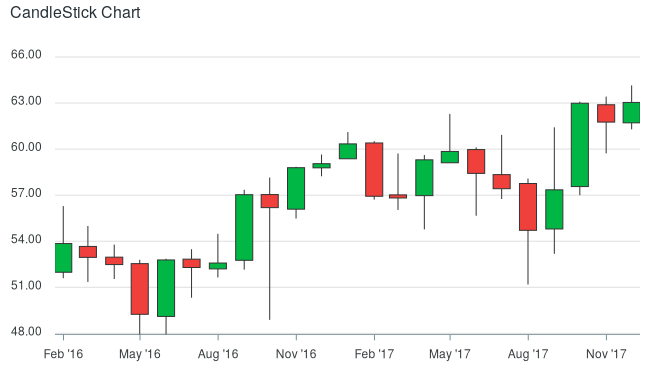
A chart is made up of lots of individual market candlesticks. There are several types of candlesticks, but let’s take a look at bullish and bearish. You can often see green and red bars scattered all over charts. What do they mean? How do you interpret the market’s activity through these candles?
Bullish Candle
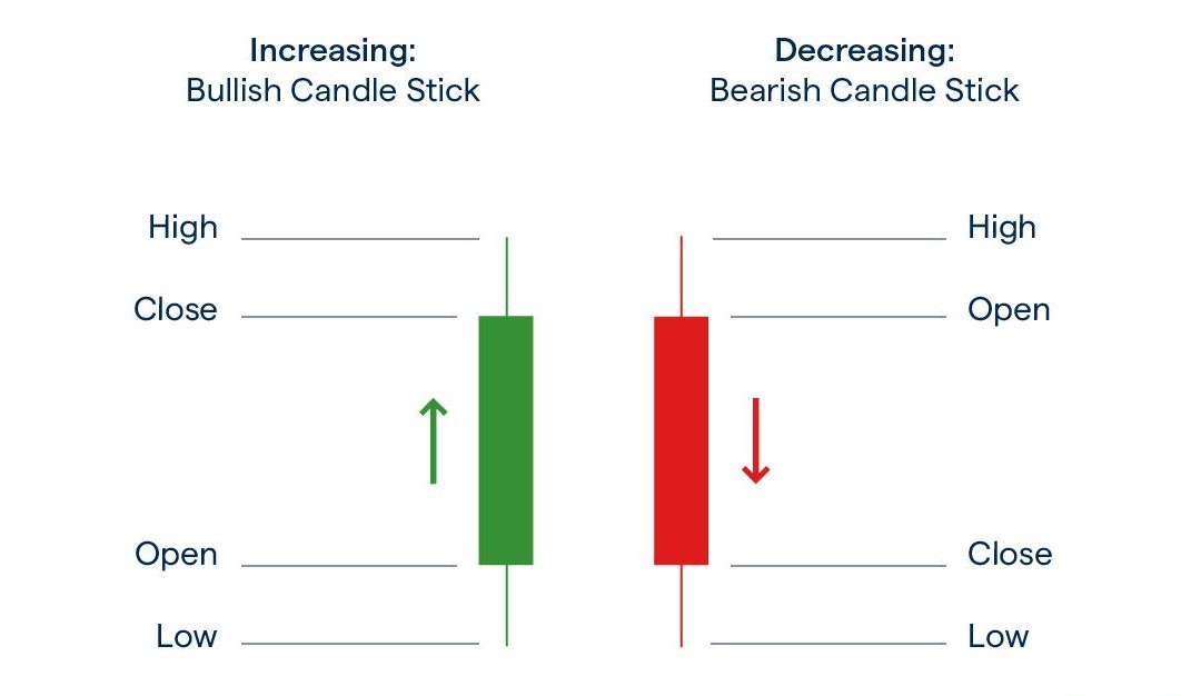
A green candle represents a bullish market. A bullish candle means that the price has increased over a given period. Remember: green means positive price movement.
Bearish Candle
A red candle typically signifies a bearish market. This means that the price has decreased over the specified period. The market is down. Remember: red means negative price movement.

Time
If you’re looking at a 5-minute chart, each fully-formed candle represents 5 minutes of price action. An hourly chart means that each candle represents an hour. A day chart signals a day’s worth of activity, and so on. These timeframes play a pivotal role in helping us determine when and how we should enter a market.
You can learn more about short-term and long-term trading in this free article I wrote!
How To Interpret
Traders garner information from these candles. They tell you all you need to know about what’s happening in the market.
The rectangular part of the candle is known as the “Real Body.” It shows us the specific price action relating to the opening and closing price.
In terms of the bullish candle, the bottom of the body shows the opening price, while the top shows the closing price. Bearish candles are the exact opposite. The bearish candle’s top is the opening price, while the bottom is the closing price—since the bearish candle is displaying a price decrease.

When looking at charts, you’ll often see candles with vertical lines stretching on both ends. These vertical lines are referred to as the wicks of the candles. The wicks indicate the highest and lowest price of the period. The price would have touched the very top and the very bottom of the wicks as the candle was forming for closing. This is invaluable information for a trader as it gives us an idea of the overall price range.
These candles represent ticks. These ticks are the overall price movements within a specified timeframe. In futures markets, ticks are how we make money. Each tick represents a value in a futures contract. The more upward ticks we see in a trade, the more money we make. Check out my article on tick values to understand how we use them to make profitable trades. It’s another resource you can leverage when building your trading strategy!
The Bottom Line
The above is some of the basic information required for reading a candlestick chart. All of the data presented on charts is based on price action. Bullish candles signify the market pushing higher as price increases. If you spot bearish candles, this is interpreted as price decreasing or the market falling. There are wicks visible on both ends of the market candlesticks, representing the highest and lowest prices.
Market candlesticks serve as excellent indicators of traders’ emotions. When traders are feeling confident in a market, we’ll see more bullish candles. If they’re pessimistic about a market, then bearish candles will dominate the chart.
Smart traders rely on candlesticks to make trading decisions since they can help forecast the short-term direction of price actions. With ample practice, you’ll be able to read patterns in trading charts in no time.
Take advantage of my free trading resources to get more in-depth information on how to become a better futures trader! And don’t miss tomorrow morning’s edition of the Daily Direction as we prepare for another week of trading!
Keep On Trading,

Stay tuned for my next edition of Josh’s Daily Direction.
And if you know someone who’d love to make this a part of their morning routine, send them over to https://joshsdailydirection.
The post Why These Lines on Our Charts Are So Important appeared first on Josh Daily Direction.


